Glass Art From Jeremy Sinkus

Biography –

Jeremy Sinkus was a mineral collector. Now for him glass is his main mineral, he uses it to explore the unknowns about what lies in our oceans. He has a fondness for natural history which is seen in some of his sculptures like Doec Buddha “Hed Spase.” He first dove into using glass as a media in the late 90’s and his favorite thing about it is that it opened infinite expression to his fascinations of the subterranean world. He now works and lives in Shelburne Falls, Massachusetts in an old mill studio powered by hydro-electricity.

Title: Nodule #8 “geo nodule”
Date: 10/9/19
Media: Glass
Size: 8lbs. 10″x10″x7″
Location: Nodules
https://jeremysinkusglass.com/collections/nodules/products/nodule-8-geo-nodule

Title: Dodec Buddha “Hed Spase”
Date: 8/31/19
Media: Glass
Size: ~5.5″ tall
Location: Sculptures
https://jeremysinkusglass.com/collections/sculpture/products/dodec-buddha-hed-spase

Title: Jellyfish Pendant (opal series)
Date: 6/5/20
Media: Opalescent glass rind
Size: ~1 1/2″x1/2″
Location: Jewelry
https://jeremysinkusglass.com/collections/pendants/products/jellyfish-pendant-opal-series

Title: Contemporary Art Nodule #15 (battery of a future thing)
Date: 6/5/20
Media: Borosilicate glass
Size: 2 3/4′
Location: Nodule
https://jeremysinkusglass.com/collections/sculpture/products/contemporary-art-nodule-15-battery-of-a-future-thing

Title: Ocean Inclusions “Sculpture”
Date: 1/18/19
Media: Glass
Size: Tallest crystal 18″x6″
Location: Sea Life
https://jeremysinkusglass.com/collections/sea-life/products/ocean-inclusions-sculpture

  1. What is the subject matter?
    Inclusion
  2. Genres. Is this a still life (group of things)? a portrait (a painting, drawing or sculpture of a person)? or a landscape/seascape/cityscape (picture of the land/water/city)? other (explain)?
    Still life in the water.
  3. Style/form: Is this artwork realistic (as real as possible)? abstract (distorted reality)?  non-objective (as far from reality as possible)? symbolic? functional? other (explain)?
    Pretty realistic, there’s a squid in one of the crystals on the right which looks like something out of a movie, but also very realistic. Has some symbolism with inclusion because there’s so many different animals who all share the same place to live.
  4. Description. Identify the sensory qualities (art elements). Can you identify a color scheme? Why do you think the artist might have chosen the colors she/he did? Do they make sense? What kind of lines did the artist use? How does the texture add to the work? etc.
    The color scheme seems to be focused around red, blue, and yellow. The animals are mainly variations of those colors and they help draw attention to the colors that are not in the color scheme. The audience’s eyes is drawn to the kelp behind the fish in the tallest crystal because it’s not apart of the color scheme. It does make sense. The artist uses very clean lines for the crystals, but for the animals they are more bumpy to show movement.
  5. Discuss the formal properties – use of design principles.
    The artist uses the height of the crystals to create a focal point. The tallest one is in the center with the second tallest ones around it which help to draw the audience’s eye. There’s also movement because most of the animals look like they’re floating in the crystals.
  6. Interpretation. What do you think the artists was trying to say? Why do you think he/she chose this subject?
    I think the artist was trying to say look how cool diversity is. It adds depth and texture to our worlds and its also all around us even if we can’t see it in the deep depths of the ocean. I think they chose this subject because they enjoy the mysteries sea life has to offer and how they’re very different but also similar.
  7. What feeling does this artwork give you and why?
    This artwork gives me a sense of calm because when I imagine sea life I also imagine the sea and its waves which have a regular rhythm. It reminds me about seeing little fish float around in the water and let the current do the work to move them.
  8. What part of the artwork is your favorite and why?
    My favorite part of the artwork is the whale because I think whales are really interesting and they are one of the largest animals alive. The blue tones he uses on the whale make it look really realistic and beautiful.
  9. Judgment: Defend this as a work of art using one of the theories of aesthetics (or combination): Art as Realism – Art for Formal Properties – Art as Expression – Art as Functional.
    This art has a realism aesthetic because it accurately portrays the sea life. When I look at the whale, the turtle, or the fish it reminds me of what I’ve seen when I’ve visited the ocean. The lines which make it look like the animals are moving add another element of realism to the piece. The movement looks very natural.

Extra Information:
Jermey Sinkus’ instagram and shop – https://www.instagram.com/jeremysinkus/
https://jeremysinkusglass.com
Mobile Plan

These are the photos I found that provided some inspiration for my designs below.

Artist Statement :

The subject matter of this piece is my bunny April. Some elements I used in this piece is movement, I made it look like the bunny is jumping. When I was cutting out the cardboard I realized it was hard to make those fine cuts, so I’ll probably rescale it to a bigger size. I really like how the bunny looks in the colored drawing, but the use of the grass in the cardboard version still needs some work. Part of it was I had a hard time punching holes to put the string through it. The other part was it didn’t quite have the balance I was looking for since I accidentally made one grass piece longer than I had planned.

TAG Critiques

Thanks to Cecilia and Erica

T – I very much enjoy the rabbit.

A – What exactly is above it?

G – It would be cool if you did it with a bunny in various locations/seasons.

T – I love that you chose to make a bunny for your mobile! it’s so cute

A – Is there a reason she’s jumping? To make the mobile work better or for some meaning or something?

G – If you made another one it would be sweet to do Chelsea (My dog) so they match :).

The Glass Bowls of Mountains and Color


Mountains of my Childhood


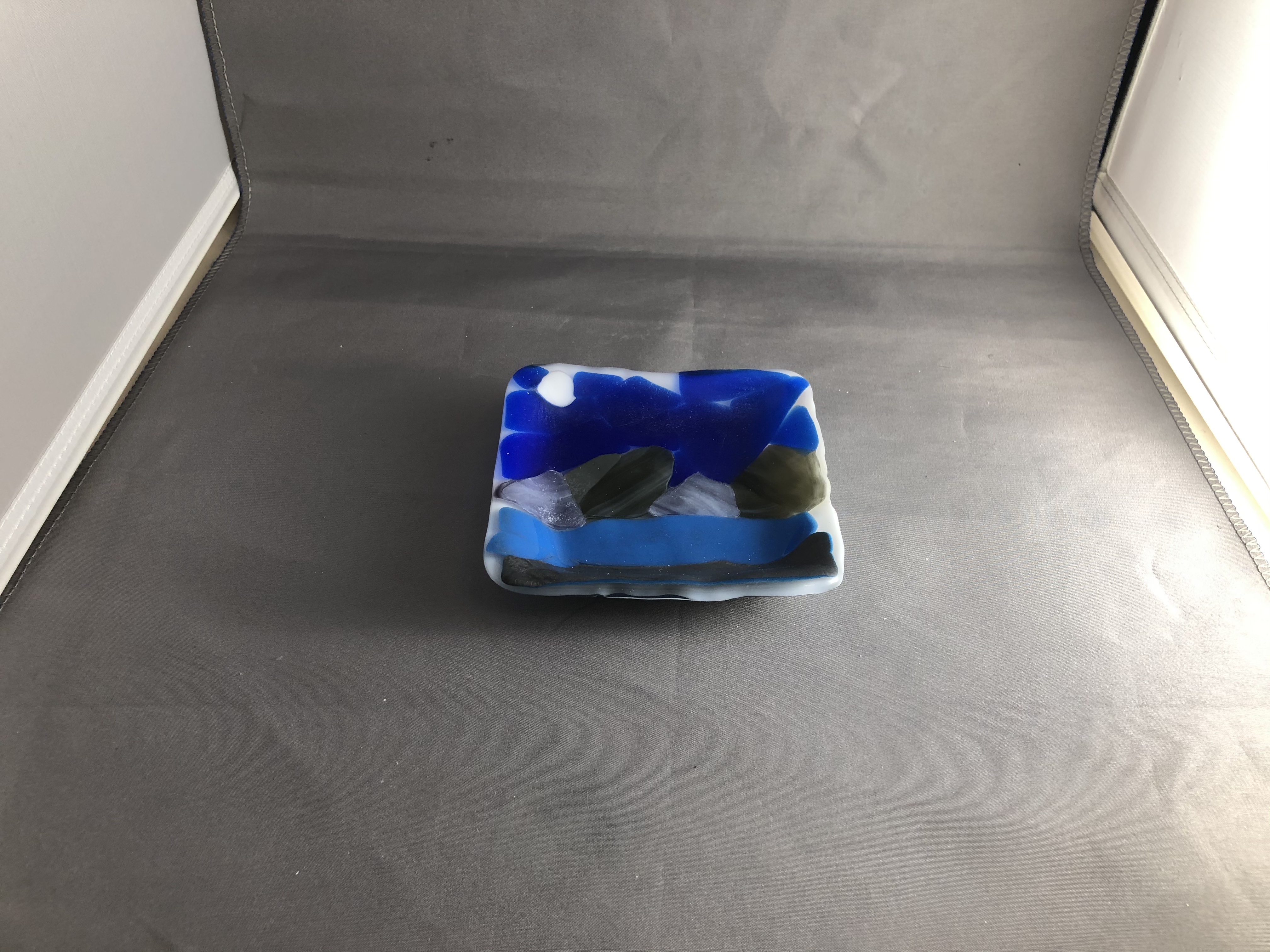
My first project was the mountain bowls. My art work looks like mountains in the nighttime with a moon shining overhead. This landscape also has an ocean before the mountains. The subject matter is my memories. Some elements or principles most obvious in my work is using different shapes of glass to fit together smoothly.

My artwork is made up of colored, clear, and white fusible glass. It started off with tracing the mountains and making sure they all fit together. It was sort of a puzzle trying to get all the pieces to fit together. Especially when I tried to cut off small edges of pieces, usually they wouldn’t cut or cut all the way, so I would have to go to the grinder. I would cut this pieces by scoring the glass with a hand cutter, then I would use running pliers to put pressure on the score and split it.

The next photo is after I fired it for the first time. I really liked how the texture of the mountains came out with those layers. It‘s inspired by the Boulder flatirons where I used to live. I tried to show emotions of isolation, but calmness with contempt. My goals for this art work was to figure out how I could fit all these different pieces together to resemble a scene with bits of a place I grew up around. My goals as an artist is to have fun with the pieces I create, this piece did help me reach my goal because it was fun to experiment with different techniques or textures I could apply to the glass.

The final piece is pretty close to what I imagined. I learned that cutting small pieces of glass is pretty hard, so the grinder was my good friend in this project.

The Pinwheel of Color


This piece was more of a fun experiment that I just put together to see how the glass would look with 2 clear pieces rather than 1 clear and 1 white piece. I used stringers and placed them in a star like shape in the center, then I cut a lot of different triangles to fit in between them.The first photo in the kiln is just after I glass tacked the pieces to the clear glass, the second in the kiln is after it was fired and I put it in a mold to slump it into a bowl. The finishing touches including some grinding and sanding to even out the edges and make sure it’s as smooth as I want it to be. The final piece turned out okay, the grinder made some marks when I smoothed it out, so it’s not exactly how I wanted it to be.

Tag Critiques

Julia Derkes –

T- I liked all the colors you used. They all go well together.

A – Why did you decide to do this? Is there meaning behind the colors?

G – If you created another bowl it would be cool to make a rainbow bowl or one with reds, and oranges since you have one with greens ans blues

Annika Schiller –

T – I like the cool color palette you incorporated.

A – why did you choose blues and greens?

G – it would be nice to incorporate some texture on the triangles.

Luxury Interior Glass Hanging Sculpture by Bernard Katz Glass

There are 5 hanging glass sculptures, they have holes in the top of them for hooks that connect it to the ceiling. On the left side there is a glass piece that looks like an airpod, the glass piece to the right of it looks like a boot, and the glass piece to the right that looks like a stretched out ghost. The next piece on the right looks like a tadpole and the piece furthest on the right looks like an airpod. All these pieces are white on the top and a little more transparent towards the bottom. 

I see the glass blowing technique and they use special scissors and other tools to help shape the glass. The empty space between the glass pieces creates lines that help draw your eyes to the piece. It also creates a balance because it looks like there is even amounts of space in between each piece. There is movement in the way the glass was blown, so it looks like it is moving up towards where it is hanging.

I think they created this piece hanging to show fluid movement. The pieces themselves seem a little random, but when put together they look almost like a finished puzzle. It creates a sense of awe and sort of calmness because of the more neutral tones. These pieces are stars from a sky with a fluid movement perspective from earth. It looks like it moves because the top is more opaque and the end is smaller and sort of stretched out.

I think it is successful because it takes a lot of patience to make sure pieces fit together how they were intended to. Especially when each piece is hand blown glass. The forms seem random, but they each have a purpose in the place they fit, which helps to create the balance and make it more appealing to the eye. Mastery, the techniques they used are very advanced and the piece seems simple, but has multiple elements to them.

Interviewing Kate

Kate is a sophomore and loves Chinese food. Her favorite thing to do in her free time is to play video games, listen to music, and play with her cats. She has 2 cats named Mable and Lucas. Her favorite musician is Troye Sivan. Kate doesn’t have a greatest fear, but says her super power is to eat a lot of food when she’s hungry. Although there are interesting classes offered at this school, her favorite class is her off period.

Design a site like this with WordPress.com
Get started